How to Differentiate Between Passive and Active Power BI Users
Not all Power BI users are equal. Learn how BI Pixie distinguishes between passive viewers who glance at reports and active users who click, filter, and explore — and why this distinction matters for measuring real adoption.

The Challenge
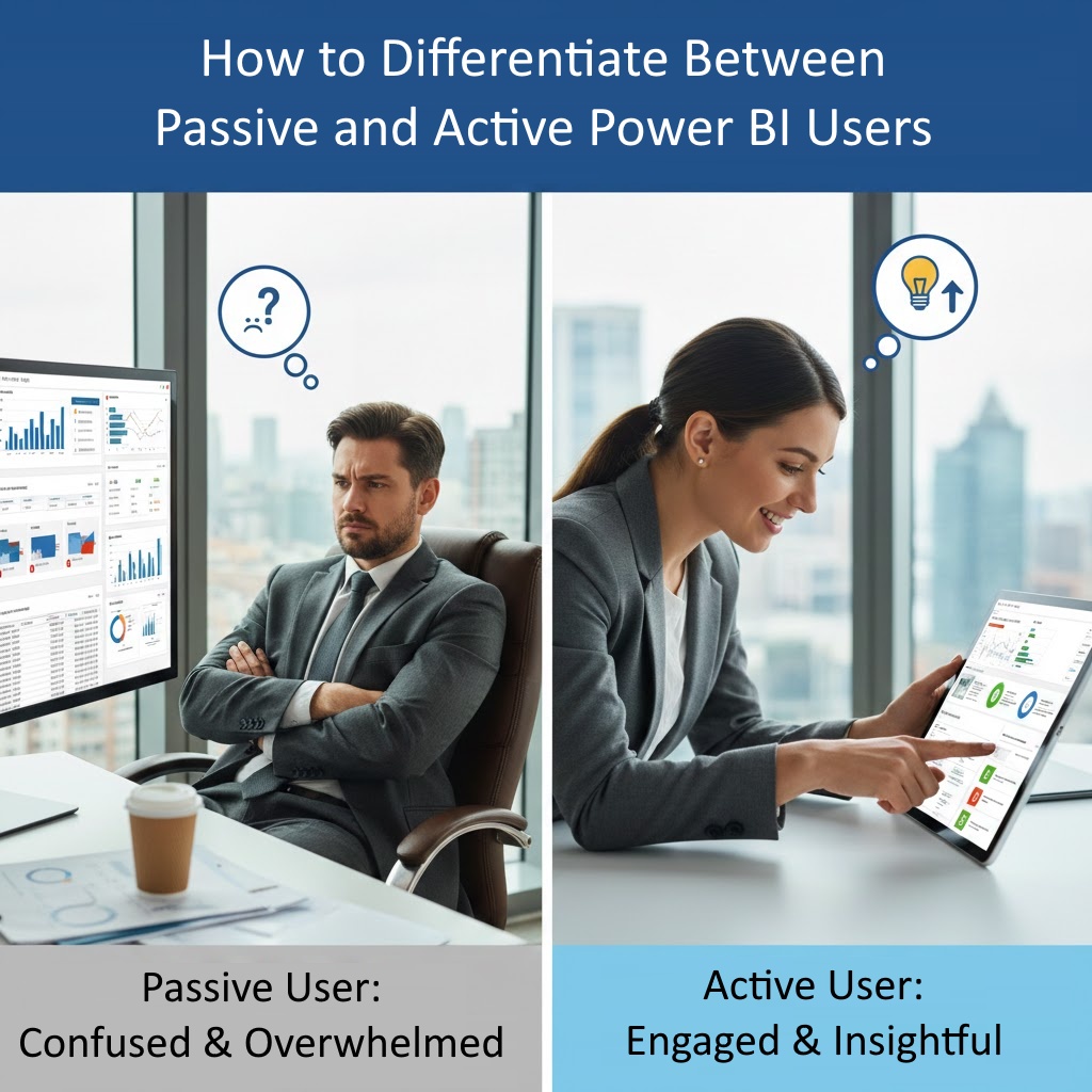
As a BI professional, you face a critical question every day: Are your users truly engaging with your reports, or are they simply opening them and walking away? In Power BI, you can only get report and page views, so, you cannot differentiate between passive and active users.
This distinction matters more than most realize. Your Power BI environment might show hundreds of page views, giving the impression of healthy adoption. But here’s the uncomfortable truth: page views don’t equal engagement.
A user could open your executive dashboard every morning as part of their routine, glance at it for five seconds without clicking anything, and then move on to their emails. That counts as a “view” in Power BI Usage metrics, but did it drive any business value? Did they make a decision based on that data? Did they interact with the insights you worked so hard to present?
For Power BI developers, this creates frustration. You spend weeks perfecting slicers, building sophisticated drill-throughs, and creating interactive bookmarks—only to wonder if anyone actually uses these features. You’re building in the dark, making design decisions without knowing which elements drive value.
For BI leaders, the stakes are even higher. You’re defending million-dollar BI budgets to executives who want proof of ROI. You need to demonstrate that users aren’t just opening reports—they’re actively using them to make better decisions.
The fundamental challenge: Without distinguishing active from passive usage, you can’t truly measure the success of your Power BI investment.
Why This Is Important
Understanding the difference between passive and active users isn’t just an interesting metric—it’s essential for several critical reasons:
1. Budget Justification
When executives ask for ROI on your Power BI investment, showing high page view counts isn’t enough anymore. They want to know if people are actually using the reports. Active engagement metrics provide concrete evidence that your BI platform drives business value.
2. Resource Allocation
Your development team has limited time and budget. Should you invest in building new reports or improving existing ones? Active engagement data tells you which reports deserve more attention and which ones are essentially digital shelf-ware.
3. Design Decisions
If 90% of your users never click a single slicer or bookmark, you’re building the wrong type of reports. Active vs. passive metrics guide you toward designs that match how your users actually work.
4. User Training Needs
Low active engagement might indicate that users don’t understand how to interact with your reports. This insight helps you target training efforts where they’re needed most.
5. License Optimization
With Power BI’s per-user licensing model, you’re paying for every assigned license. Identifying truly passive users helps optimize license allocation and reduce unnecessary costs.
6. Migration Success
If you’re migrating from legacy BI tools to Power BI, tracking active engagement shows whether the migration is truly successful or if users have simply reverted to old habits with a new interface.
The bottom line: Active engagement is the difference between a BI investment that transforms your business and one that just generates colorful dashboards no one uses.
What’s Available Without BI Pixie
Power BI provides native usage metrics, but they paint an incomplete picture:
Built-in Usage Metrics
Power BI’s Usage Metrics Reports show:
- Page views: How many times a report page was loaded
- Unique viewers: How many different users opened the report
- Distribution method: Whether users accessed via workspace, app, or web
What’s Missing
These metrics tell you who opened what, but they don’t tell you how users engaged:
- No interaction tracking: You can’t see if users clicked slicers, applied filters, or used bookmarks
- No time measurement: You don’t know if users spent 2 seconds or 20 minutes on a page
- No drill-down visibility: Can’t tell if users explored deeper levels of data
- No tooltip tracking: Don’t know if users discovered your carefully crafted tooltips
- No visual-level data: Can’t identify which specific charts or tables users interact with
- No distinction: Everyone counts the same whether they’re actively analyzing or passively viewing
The Reality
With only native Power BI metrics, a user who opens your sales dashboard and stares at it for 3 seconds looks identical to a user who spends 15 minutes slicing data, drilling through details, and exploring trends.
This limitation forces you to make critical decisions based on incomplete information. You might:
- Invest development time on reports with high views but zero engagement
- Cancel valuable reports that have fewer views but highly engaged users
- Miss opportunities to optimize high-traffic reports that users struggle to interact with
- Fail to identify training needs because you can’t see interaction patterns
The fundamental gap: Native Power BI metrics measure presence, not engagement.
What’s Available Using BI Pixie
BI Pixie transforms your understanding of user engagement by tracking not just page views, but actual user interactions. Here’s what becomes possible starting with a 14-day free trial:
Active Engagement Tracking
BI Pixie automatically tracks and classifies every user interaction:
- Slicer clicks: See which slicers users interact with and what values they select
- Bookmark usage: Track when users click bookmarks to change report views
- Filter changes: Monitor how users customize their view with filters
- Button clicks: Know if users engage with action buttons and navigation elements
- Drill-through actions: See when users drill through for deeper analysis
- Tooltip views: Track which tooltips users discover and view
- Visual interactions: Monitor slicing and dicing within charts and tables
- Link clicks: Track navigation through hyperlinks in tables and visuals
Passive vs. Active Classification
Every session and user is automatically classified at the report and page levels:
Active Sessions: Include at least one user interaction (click, filter, slice, etc.)
Passive Sessions: Only page views with no interactions
This simple distinction provides powerful insights:
- Identify reports with high views but low engagement (candidates for redesign)
- Find highly engaged reports that deserve more investment
- Track active vs. passive user ratios over time
- Segment your user base by engagement level
Detailed Engagement Metrics
BI Pixie provides comprehensive metrics including:
Session-Level Analytics:
- Average interactions per session (report and page level)
- Session duration with active time calculation
- Active vs. passive session ratios
- Interaction patterns and sequences
User-Level Analytics:
- Active users: Those who interact with reports
- Passive users: Those who only view without interaction
- User engagement scores and classifications
- Individual user interaction history
Report-Level Analytics:
- Engagement rate: Percentage of sessions with interactions
- Average clicks per active session
- Most-used interactive elements
- Engagement trends over time
Visual Heatmaps (Professional Tier+)
See exactly where users click on your report pages:
- Visual-level usage analytics showing hot and cold zones
- Click patterns revealing navigation flows
- Identify overlooked visuals that need repositioning
- Optimize page layouts based on actual user behavior
Real-Time Monitoring (Enterprise Tier)
- Track engagement patterns as they happen
- Set alerts for unusual passive behavior
- Monitor adoption of newly deployed reports
- Identify engagement drops requiring immediate attention
ROI Calculations
Combine active engagement metrics to support licensing decisions:
- Calculate cost utilization by comparing active user vs. total users
- Measure engagement value for budget justification
- Identify licenses that could be reassigned or eliminated
- Demonstrate concrete BI platform ROI to executives
Actionable Insights
BI Pixie doesn’t just show data—it helps you act on it:
For Power BI Developers:
- Prioritize which reports need interactive element improvements
- Identify successful interactive patterns to replicate
- Test impact of design changes on active engagement
- Justify development time with engagement evidence
For BI Leaders:
- Report active engagement rates to executives
- Identify training needs based on low interaction rates
- Optimize license allocation using active user data
- Prove BI investment ROI with concrete engagement metrics
The Bottom Line
The difference between passive and active users is the difference between appearance and reality in your BI program.
Without BI Pixie: You see page views and assume engagement. You make decisions in the dark. You can’t prove ROI beyond “people opened our reports.”
With BI Pixie: You know exactly who’s engaging and how. You make data-driven decisions about design and investment. You prove concrete business value with active engagement metrics.
If your organization has invested significantly in Power BI, can you really afford not to know whether users are actively engaging with your reports?
Ready to Understand Your True User Engagement?
Start your free BI Pixie trial today and discover the difference between users who view your reports and users who actually use them.
BI Pixie is available on Microsoft Marketplace. Deploy in minutes within your Azure environment with full data residency and security.