In the previous article, you learned how to deploy BI Pixie Dashboard from Microsoft AppSource and connect it to your selected storage. With the app deployed, you can start analyzing the usage and engagement of your BI audience. This article describes each of the report pages that are available in BI Pixie. Review each of the sections below to leverage the wide-range of analytics capabilities of the app.
You can find a detailed reference of the metrics that are used in the app here.
Main Pages
- Summary
- Engagement Analysis
- Producers and Consumers
- User Adoption
- User Attrition
- User Satisfaction
- Survey Results
- Heatmap
- Custom Visuals Heatmap
- Performance Analysis
- Data Exports
- Data Auditing
- RLS Auditing
- Design Impact
- Design Changes
- Business Impact
Summary
The Summary page provides a high-level overview of the tracked Power BI reports, showing key metrics such as the number of tracked reports, users, report sessions, and engagement levels. It includes a breakdown of report activity into Interactive, Passive, and Unused categories, along with user classification (Engaged vs. Passive users). You can filter by date, project/workspace, and report name.
Engagement Analysis
The Engagement Analysis page provides a detailed view of user engagement patterns across your reports. It breaks down interactions by type (Visual Interactions, Slicer Clicks, Filter Clicks, Bookmark Clicks, Link Clicks, Tooltip Opens, Drillthroughs) and shows trends over time. The page helps you identify which reports and pages drive the most engagement and which types of interactions are most common.
Producers and Consumers
The Producers and Consumers page is available in the Azure deployment version and requires the integration with Power BI Activity Logs (as described here). This page shows both the producers (report creators and editors) and consumers (report viewers) across your Power BI tenant. It helps you understand the ratio between content creators and consumers, track publishing activities, and identify who is creating and consuming content.
User Adoption
The User Adoption page tracks how users are adopting your Power BI reports over time. It shows new users, returning users, cumulative users, and stickiness metrics (DAU, WAU, MAU, DAU/MAU). Use this page to measure the growth of your BI audience and identify trends in user adoption.
User Attrition
The User Attrition page helps you understand user churn. It shows cumulative lost users, user attrition rate, and identifies users who stopped using your reports. By analyzing attrition patterns, you can take proactive steps to re-engage users and improve report value.
User Satisfaction
The User Satisfaction page shows feedback collected from your BI audience through the Feedback Controls (Learn how to set up feedback collection here). It displays CSAT scores, satisfied vs. dissatisfied users, average satisfaction, and feedback trends over time. You can drill down by report to understand which reports are well-received and which need improvement.
Survey Results
The Survey Results page shows the results of embedded surveys (Learn how to set up embedded surveys here). It includes NPS (Net Promoter Score), time savings, financial impact, decision-making impact, and technical issues reported by users. This page helps you quantify the business value of your reports.
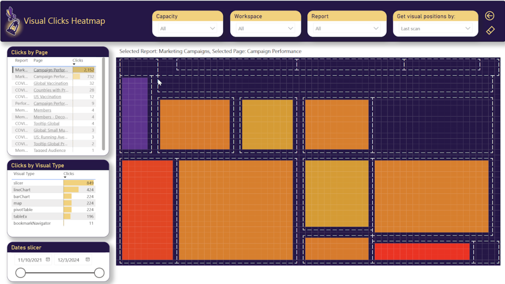
Heatmap
The Heatmap page provides a visual representation of user clicks at the visual level within your report pages. Visuals are shown as rectangles with colors ranging from low (cool colors) to high (hot colors) based on the number of clicks. This helps you understand which visuals attract the most attention and interaction. Learn how to activate the heatmap here.
Custom Visuals Heatmap
The Custom Visuals Heatmap page is available in the Azure deployment version. It shows the distribution and usage of custom visuals across your reports, categorized by their origin: Built-in visuals, Certified custom visuals, Uncertified custom visuals, and Unlisted or Unknown visuals. This helps you assess the risk and adoption of custom visuals in your organization.
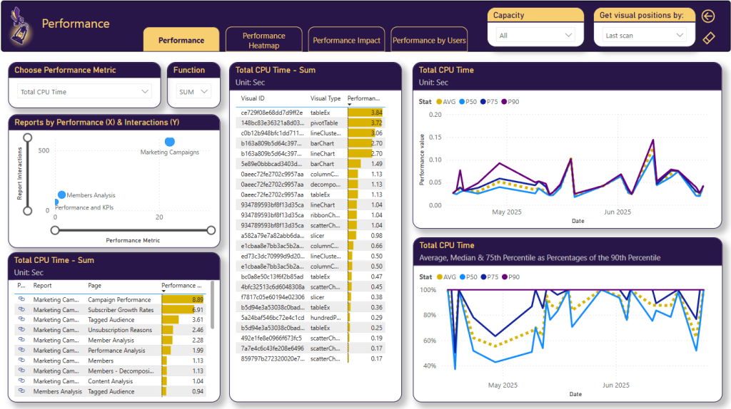
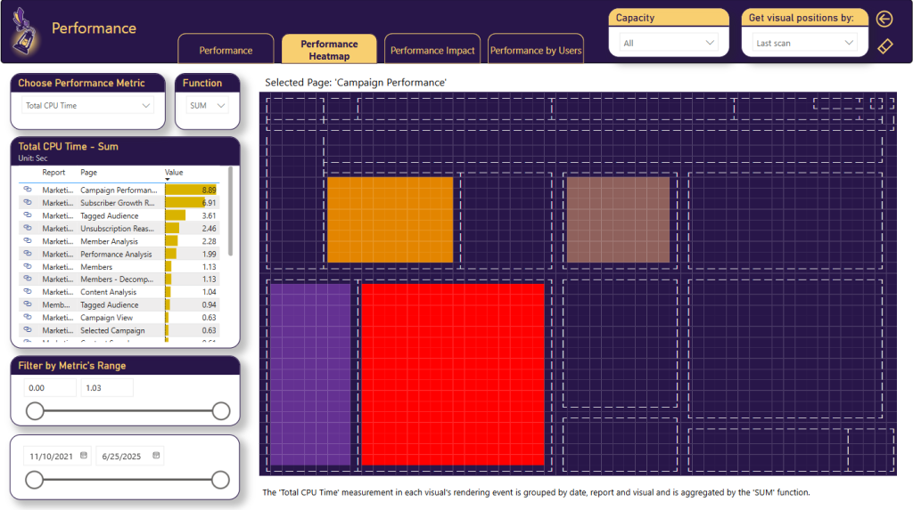
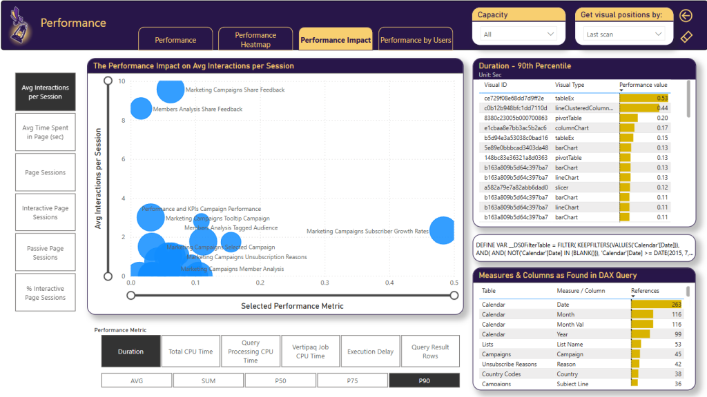
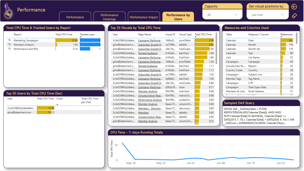
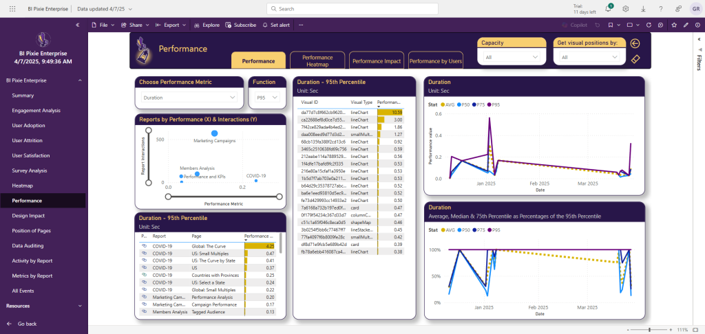
Performance Analysis
The Performance Analysis pages are available in the Azure deployment version and require integration with Azure Log Analytics (Learn how to set up performance monitoring here). These pages include four tabs: Performance, Performance Heatmap, Performance Impact, and Performance by Users. They help you identify slow-loading visuals, high-CPU queries, and correlate performance with engagement.
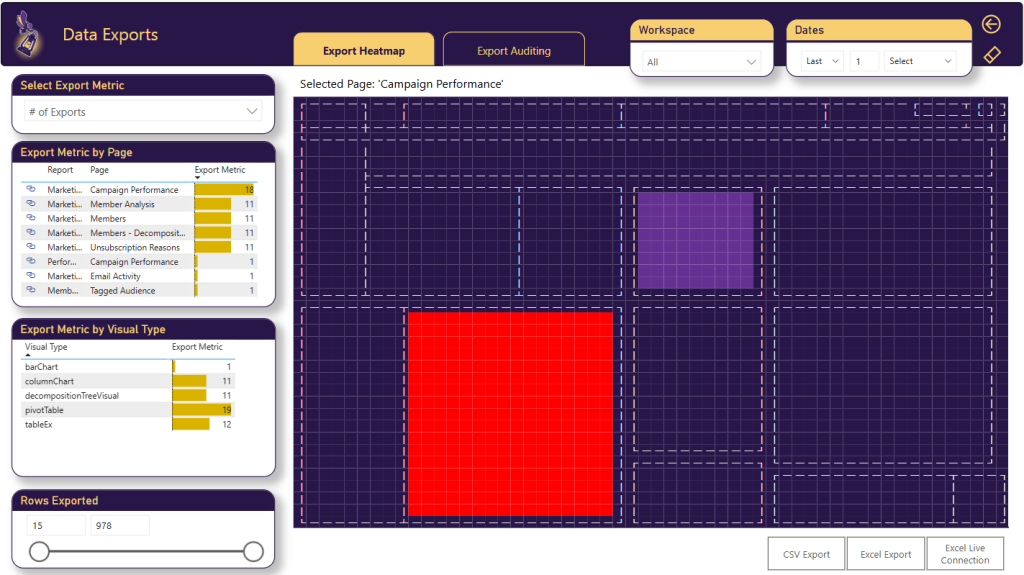
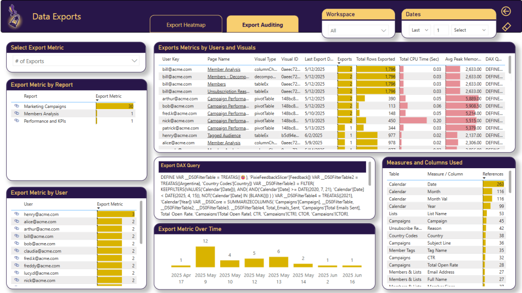
Data Exports
The Data Exports page is available in the Azure deployment version. It tracks data export activities from your Power BI reports, including exports to Excel, CSV, PDF, and PowerPoint. It helps you monitor data exports for compliance and security purposes and identify which reports and users are exporting the most data.
Data Auditing
The Data Auditing page provides insights into data access patterns. It shows which tables and columns are being accessed through user interactions, helping you understand data consumption patterns and ensure data governance compliance.
RLS Auditing
The RLS (Row-Level Security) Auditing page is available in the Azure deployment version. It tracks RLS-related activities and helps you verify that row-level security is properly configured and functioning across your reports. It shows which users are accessing data under which RLS roles.
Design Impact
The Design Impact page helps you analyze the effectiveness of your report design using three scores: Complexity Score, Usability Score, and Passivity Score. These scores are calculated based on the visual elements detected during instrumentation (number of visuals, slicers, bookmarks, table visuals, etc.). Use this page to identify reports that may need design improvements.
Design Changes
The Design Changes page tracks changes in your report design over time. When you run BI Pixie Instrumentation periodically, it detects changes in the report structure (new pages, added or removed visuals, changed bookmarks, etc.). This page helps you correlate design changes with engagement changes to understand the impact of your report updates.
Business Impact
The Business Impact page is available in the Azure deployment version. It combines data from multiple sources including BI Pixie instrumentation, Power BI Activity Logs, and Power BI Admin Scan API to provide a comprehensive view of the business impact of your Power BI deployment. It shows endorsement levels, data source analysis, and helps you understand which reports drive the most business value.