Have you ever wondered how users interact with your Power BI reports at the visual level? Where do they click?
A heatmap is common tool to uncover user interaction at the user interface level, giving you a visual story of user behavior. Using a heatmap to analyze the interactions in your Power BI reports doesn't just tell you what's working — It spotlights what's not, helping you make data-driven improvements in your reports.
In this article, you will learn how to activate the Visual Clicks Heatmap to analyze the engagement of your audience in your Power BI reports in a completely new level.
The heatmap is available in the Heatmap page of BI Pixie app in both the Starter and Enterprise versions.
By default, BI Pixie can identify click events of end-users as they interact with the visuals. However, with the activation of the heatmap, BI Pixie can map clicks and data selection events to individual visuals.
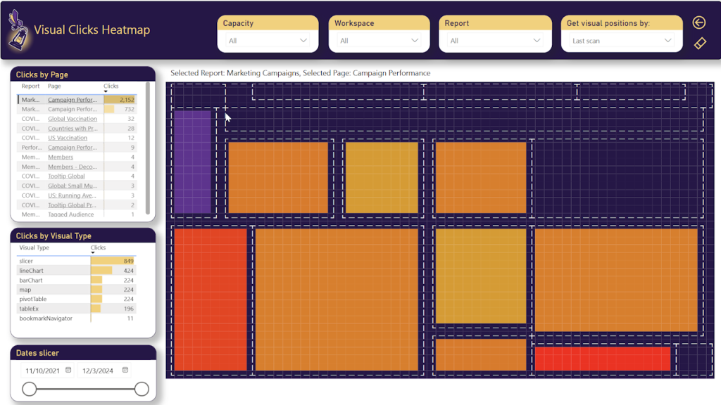
When you activate the heatmap, BI Pixie collects all the positions of the visuals in the instrumented reports. The visuals will be shown in the heatmap and their positions will be marked in dashed white lines.
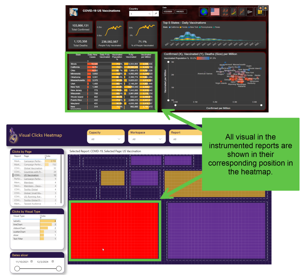
When end-users click on the visuals, BI Pixie tracks the clicks, and the data that is selected by the end users. The rectangles in the heatmap that represent the visuals will be filled with colors to represent the count of clicks in the visuals from lowest in purpose to highest in red.
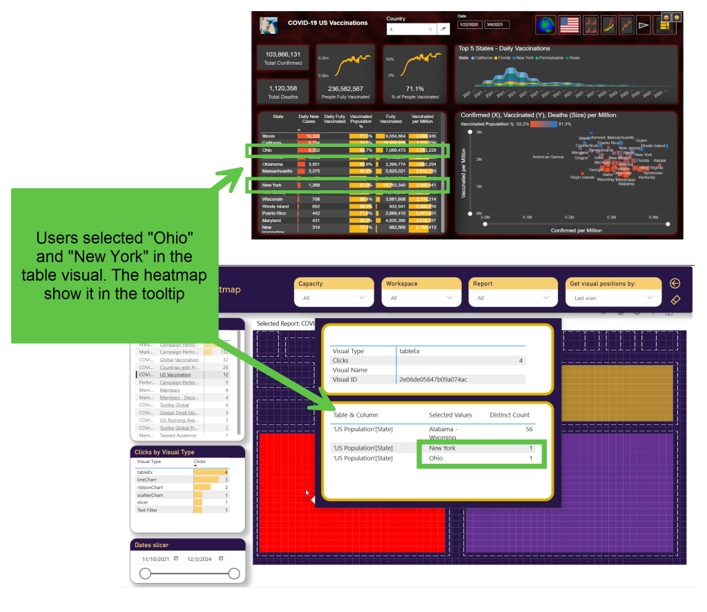
When you hover over a specific visual in the heatmap, the tooltip shows the number of clicks and the dimensional data that was selected.
To activate the heatmap as a feature, and start collecting detailed click information per visual, set the track_visual_interaction_details parameter to true in bi_pixie_config.json, and run BI Pixie Instrumentation with the new configuration.
Note: This feature increases the volume of events. To moderate the volume, you can activate the heatmap for specific reports in bi_pixie_config_details.json, instead of activating it in the global configuration file for all the reports (As a reminder, you will also need to set allow_report_level_overrides as true in the global bi_pixie_config.json file in order to allow BI Pixie Instrumentation to read report-specific configuration).
If you have sensitive data in the dimensions in your reports, you can deactivate the tracking selected values by setting the parameter include_filtered_values as false. This can be done for specific reports in bi_pixie_config_details.json or globally in bi_pixie_config.json.
When the heatmap is activated in your target reports, BI Pixie scans all the visuals to find up to 3 fields that are used in the visuals' dimensions. For example, if a scatter chart, has one field in the X axis, a second field in the Y axis and a third field as the Size, BI Pixie will detect the three fields and instrument the report to emit 3 events every time the visual is loaded or being selected. The events will include the value that the user selected and the names of the table and column that are used as the field in the visual.
To change the maximal number of tracked fields from 3 to a different number, set the parameter track_visual_interaction_max_fields to a different positive number. For example, if you want to reduce the volume of tracked events from 3 to 1, set this parameter to 1. This way, only the first field is tracked in each visual. You can also increase the maximal number of fields that are tracked, but it is recommended to do it for specific reports in bi_pixie_config_details.json instead of increasing it in the global configuration file for all reports.
To learn how you use the heatmap in the BI Pixie Power BI App, go here.
What's Next
Analyze performance (Optional)