
Analyze Custom Visuals' Engagement, Performance and Risks
BI Pixie now tracks custom visual usage across your Power BI tenant. Identify which custom visuals drive engagement, which ones slow down reports, and which introduce governance risks.
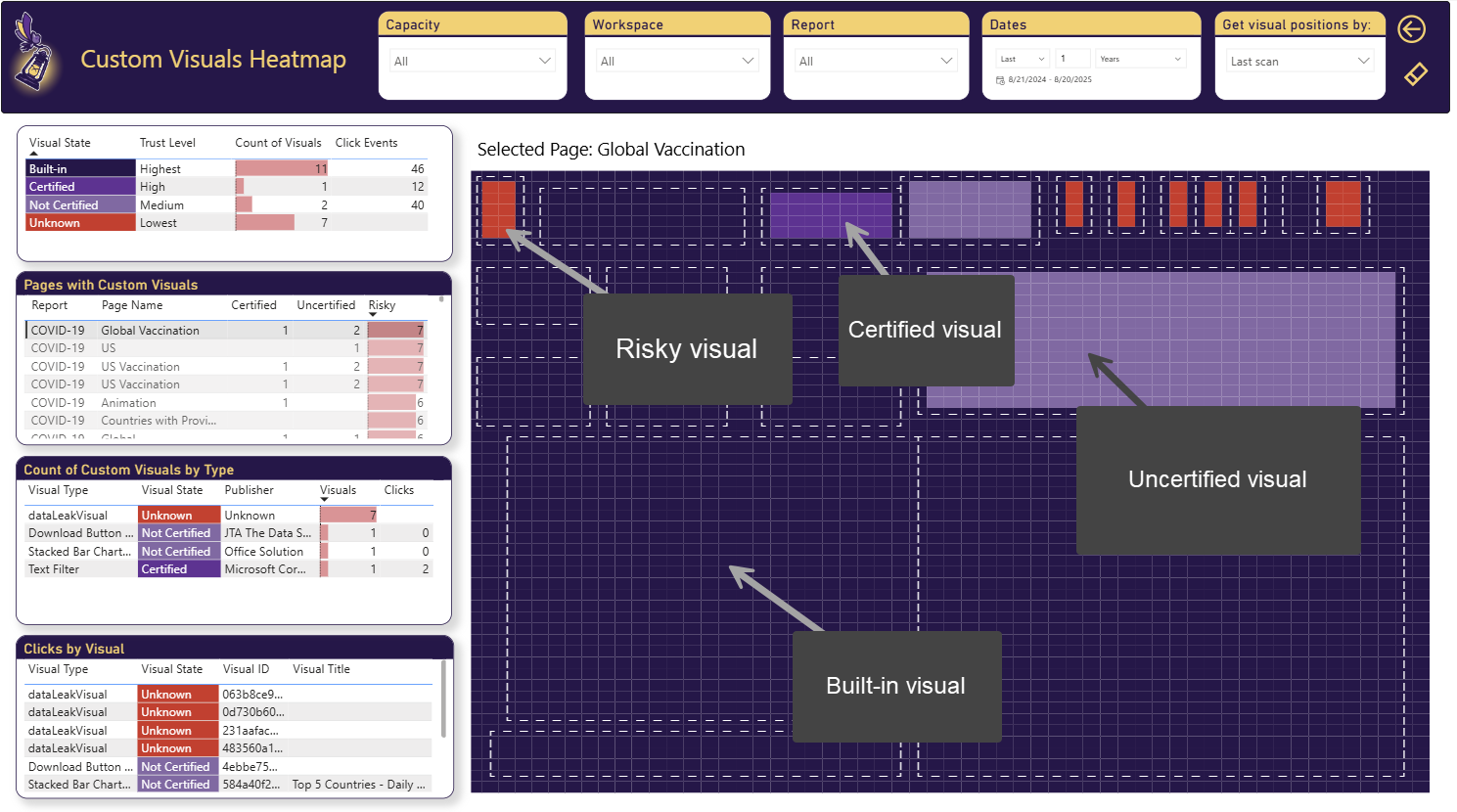
Why does governing custom visuals matter so much for your Power BI environment? Because without oversight, what looks like a creative enhancement can quickly turn into wasted budget, laggy user experiences, or even security threats. Here’s why governance is essential:
- Monitoring engagement and ROI: When you’re paying for a premium visual and want to make sure your investment is justified, tracking how often users click on custom visuals helps gauge their real value.
- Performance concerns: While most common performance challenges in Power BI are not related to custom visuals, there are situations where specific custom visuals can slow down report rendering compared to built-in visuals. Complex custom visuals can consume more memory and hamper performance. Knowing that a slow visual is a custom one, can help you prioritize and find the right path forward.
- Security and trust risks: Using untrusted custom visuals introduces potential vulnerabilities. Non-certified visuals can contain code that can transfer your data to an external untrusted source and expose your environment to risks.
BI Pixie’s August 2025 release addresses all three areas. Through its Custom Visuals Heatmap and expanded dashboard insight, you can now monitor engagement, compare performance across visual types, and flag uncertified or risky visuals at a glance.
Where are the risky Custom Visuals in my reports?
If you use BI Pixie Azure Deployment and activates the Heatmap in BI Pixie Instrumentation, BI Pixie knows what types of visuals exist and whether they are built-in, certified or unknown. This knowledge is incorporated into the Custom Visuals Heatmap page.
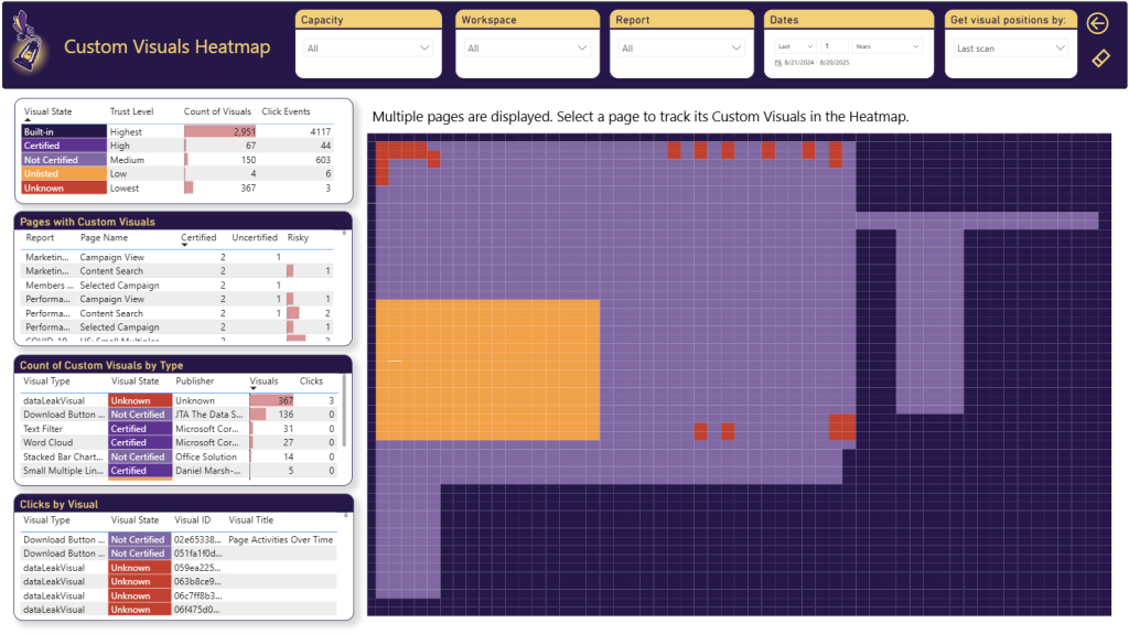
In the Custom Visuals Heatmap, you can analyze certified, uncertified, and unknown custom visuals across your Power BI reports, and see them in action on an interactive heatmap. When you load the page, the heatmap will load the locations of all the custom visuals in your instrumented reports. Visuals from multiple pages will be displayed together. Select any of the pages in the Pages with Custom Visuals table to view the locations of the custom visuals in the selected page.
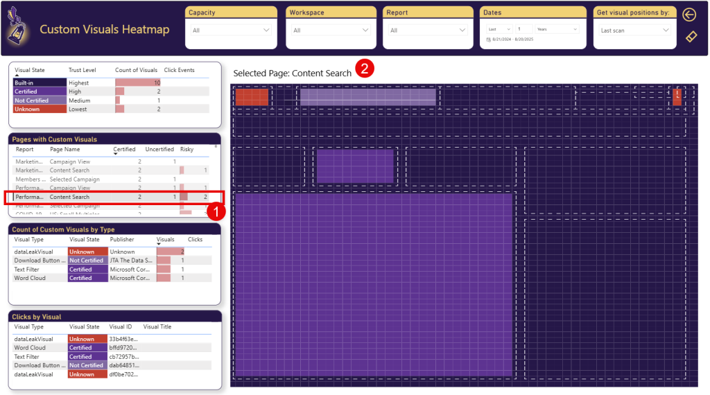
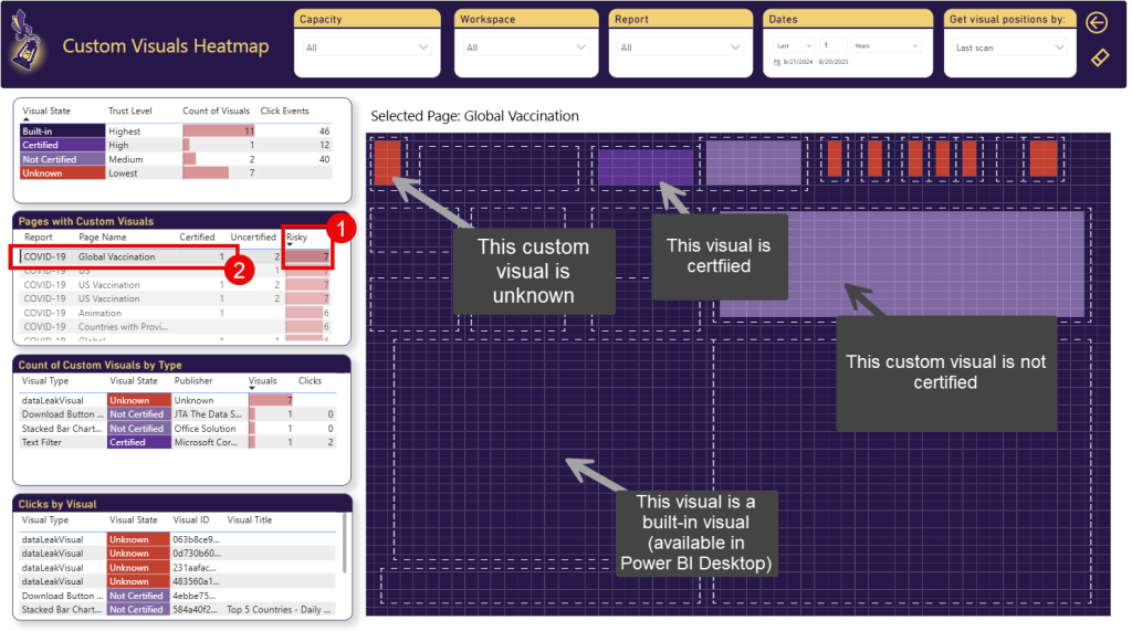
In the screenshot below, the user selected the report page “Content Search” (Highlighted as Step 1). Then, the main heatmap will load all the visuals of that page by their location and will highlight the different visuals by their state. The Visual State can be one of 5 values:
- Built-in: These are the built-in visuals available in Power BI.
- Certified: These are the certified custom visuals available on Microsoft AppSource.
- Not Certified: These are the custom visuals on AppSource that are not certified.
- Unlisted: These are the custom visuals that were on AppSource in the past, but are now removed from AppSource.
- Unknown: These are unknown custom visuals.
In the Pages with Custom Visuals table, you can find how many Certified, Uncertified and Risky custom visuals were detected in each Power BI report page. The Risky column in that table counts the custom visuals that are Unlisted or Unknown. The yellow areas in the heatmap represent Unlisted custom visuals. Red areas represent Unknown custom visuals.
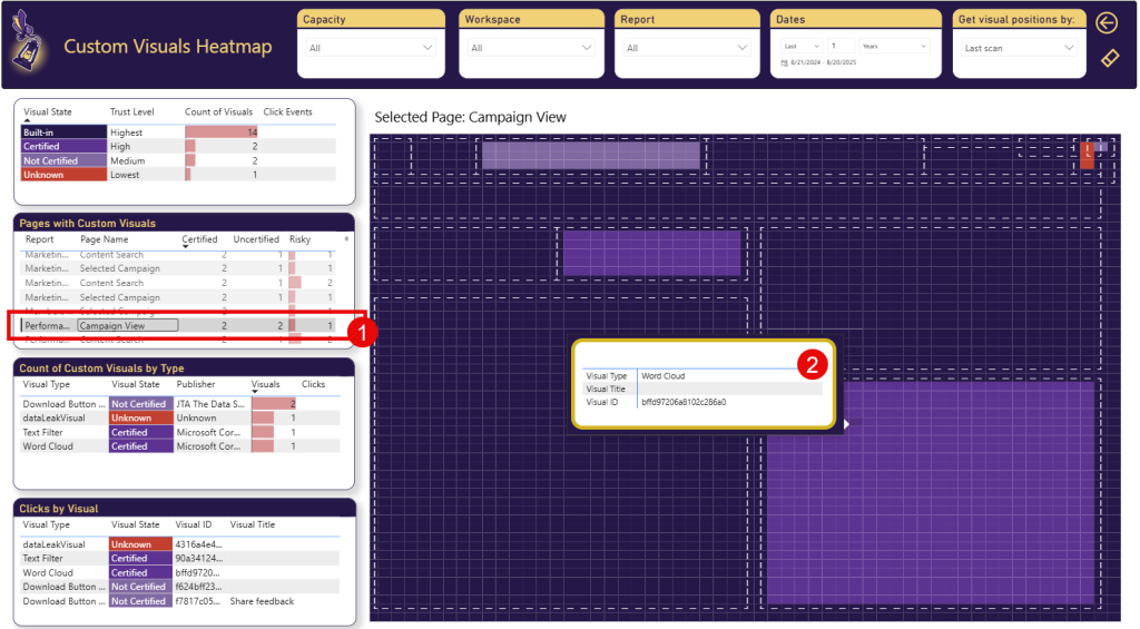
You can select different pages in Pages with Custom Visuals. The heatmap will highlight the visuals of that page (This can take few seconds to load).
When you move the mouse over a specific visual’s area, the tooltip will show you the Visual Type, Title and ID.
You can sort the Pages with Custom Visuals table by Risky column (Highlighted as Step 1 below) to find pages with high number of visuals. Then, select the highest page (Step 2) and review the different risky visuals.
How effective are the custom visuals in my reports?
In Heatmap page, you can use the Clicks by Visuals table to analyze the number of clicks visuals get, and learn about their type (e.g. Slicer, Table, Matrix) and their state (e.g. Built-in, Certified, Not certified, Unlisted and Unknown).
For example, in this quick video, we scroll down through all the visuals, and we find unknown custom visual. Clicking on it, shows us in the heatmap where it is located.
What are the performance impact of the custom visuals in my reports?
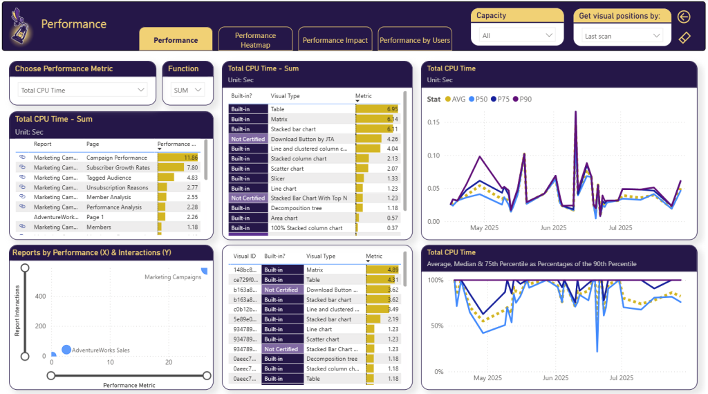
In Performance page, we have added the visuals state (Built-in, Certified, Not Certified, etc.). You can now analyze the performance by Visual type. If you find out that a certified visual is significantly slower than built-in visual with the similar experience, you can consider replacing it or prioritize optimization efforts accordingly.
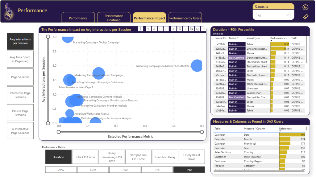
In the Performance Impact tab, you can see how different report pages are scattered by engagement and performance metrics, and analyze individual visuals. With the new “Built-in?” column you can identify slow custom visuals.
Conclusion
With the new features in BI Pixie’s August 2025 release, you get the visibility and control you need to govern visuals effectively. This article walked you through the new capabilities to gain measurable ROI, smoother performance, and stronger security.
Ready to see the new capabilities in action? Download the new BI Pixie Dashboard app now and start free to take control of custom visuals across your Power BI reports.