
Analyze Engagement at the Capacity and Workspace Levels
BI Pixie now provides engagement analytics at the capacity and workspace levels, giving administrators a top-down view of Power BI adoption and usage patterns across their organization.
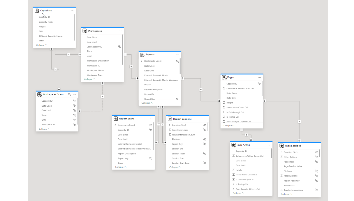
This month (December 2024 release), we expanded BI Pixie capabilities to aggregate engagement data at the Capacity and Workspace levels. BI Pixie can now read meta-information from your Microsoft Fabric or Power BI service and allow you to analyze the effectiveness of your reports by capacities and workspaces.
In this post, I will walk you through the key experiences.
To review the features, install BI Pixie App Enterprise version here or Starter version here. Both versions are the same at the visualization level.
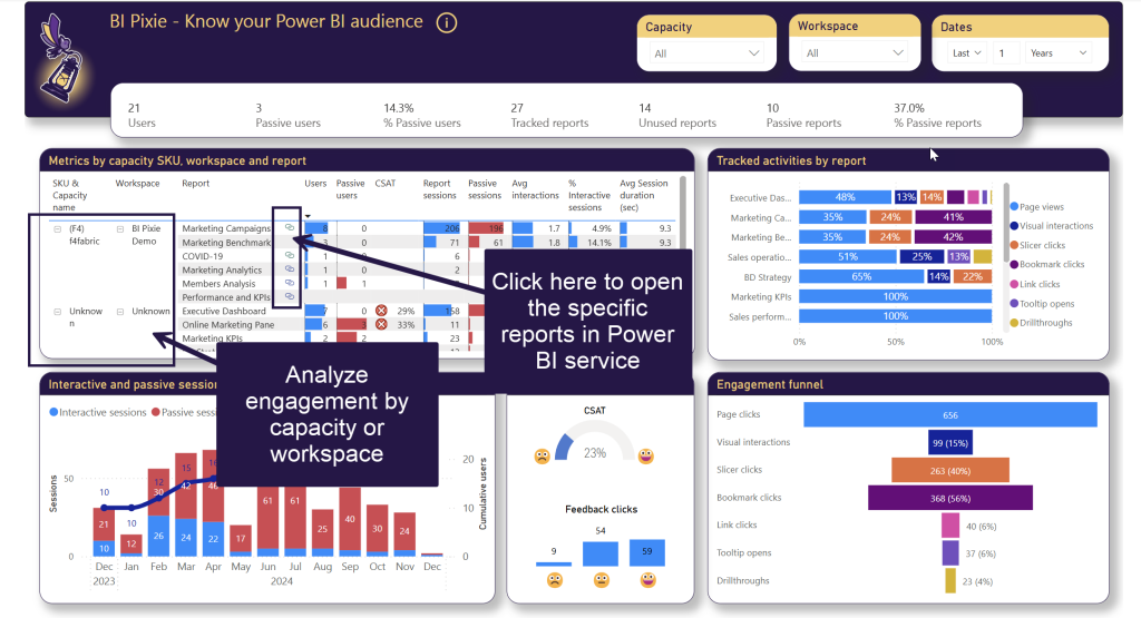
BI Pixie App aggregates key engagement, adoption and satisfaction metrics at the Capacity and Workspace levels. For example, in the Matrix visual of the Summary page, you can collapse the capacity in SKU & Capacity name to find the total number of users, passive users, and other engagement metrics are aggregated at the capacity level. In some visuals of the BI Pixie App, you can click at the hyperlinks to open the specific reports in Power BI service (if you have access to the reports). This functionality allows BI developers to locate low-engaging reports and open the reports directly from BI Pixie app for a deep dive.
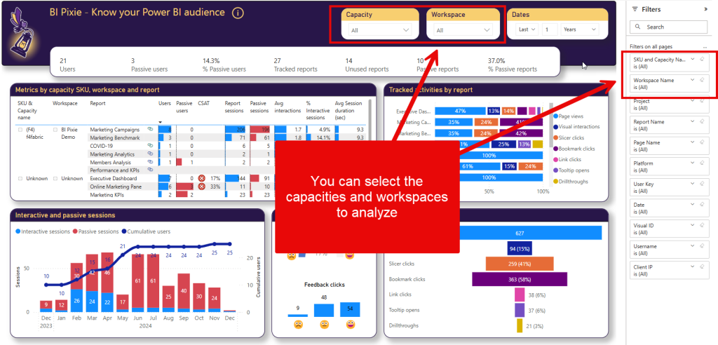
You can use the slicers and filters in BI Pixie App to narrow down your analysis to a subset of capacities and workspaces.
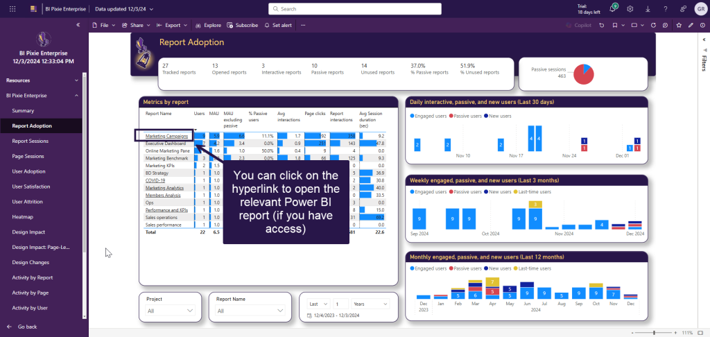
In some cases, we incorporated the hyperlinks in the report names. For example, in Report Adoption page, you can find the reports with the highest engagement. If you are curious why these reports get the highest engagement, just click the report name as highlighted below to navigate to the reports and get some ideas how they were designed.
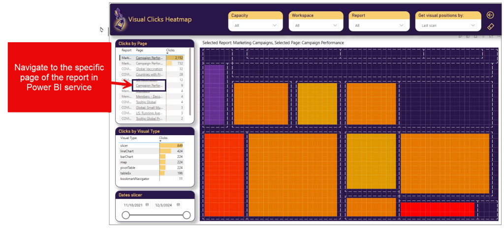
When relevant, the navigation to Power BI service is available in BI Pixie at the page level. For example, in the new Heatmap page, you can select a specific low-performing page by clicking the Clicks cell in Clicks by Page table. Then, after you review the heatmap to understand which visuals get low numbers of clicks, you can click the hyperlink as highlighted below to open the specific Power BI report page and continue the investigation.
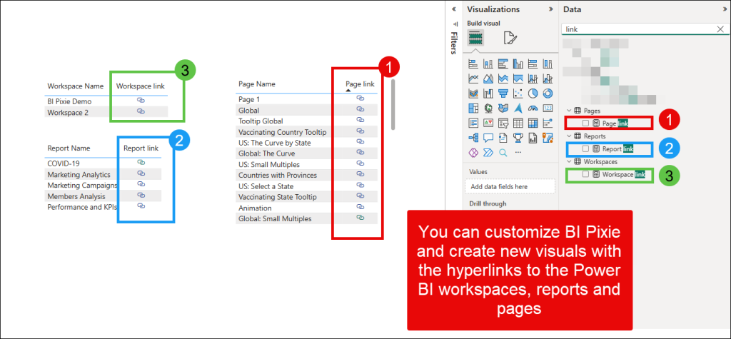
You can customize BI Pixie report and use the Page link, Report link and Workspace link as highlighted below to create your own experiences with navigations to workspaces, reports and pages.
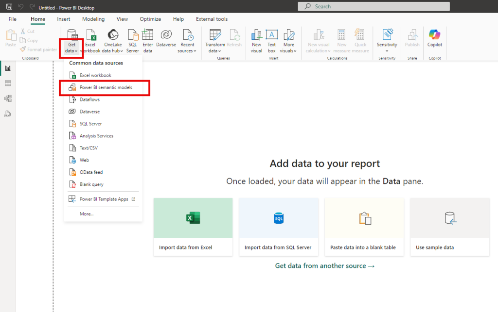
Thinking about customizations – With BI Pixie, you can create a new report using Power BI Desktop to connect to BI Pixie Semantic Model and create a customized experience to meet your specific analytics needs.
To connect to the semantic model, select Get data and then Power BI semantic models.
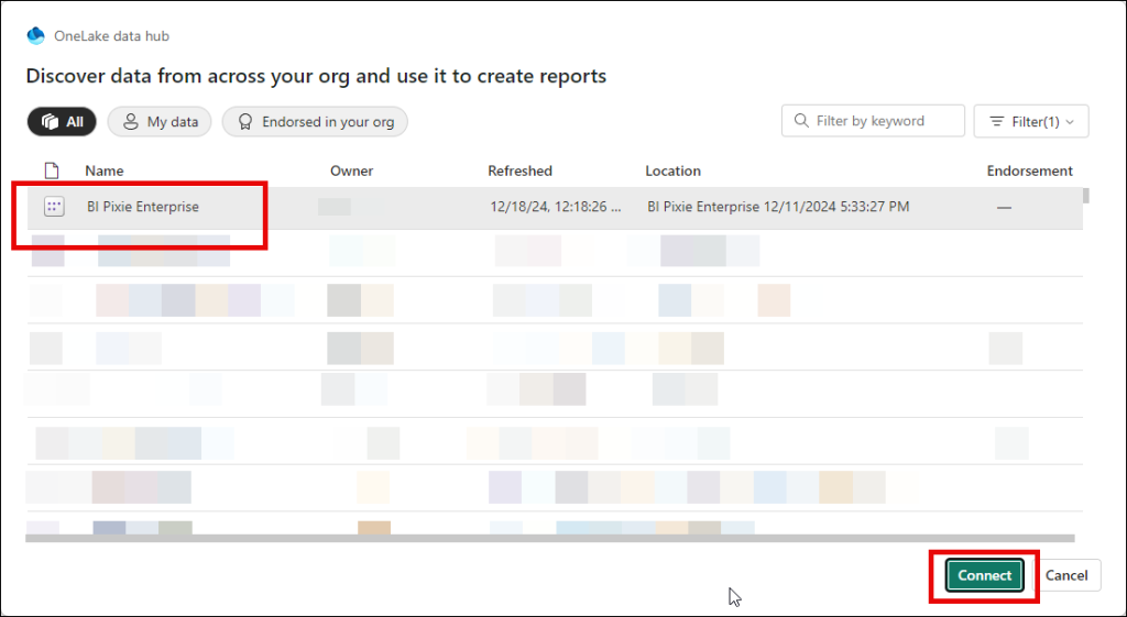
In the OneLake data hub, select BI Pixie Enterprise, and click Connect.
In the Model view, you can learn how Capacities, Workspaces, Reports and Pages are connected, and then go to Report view to create new visuals that analyze engagement, adoption, attrition or user satisfaction at different levels from Capacities and Workspaces to the Reports, Pages and Visuals.
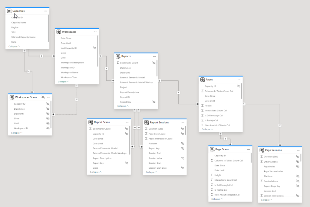
By default, BI Pixie collects usage and engagement data from your reports without associating the reports to Capacities and Workspaces. To activate the context of capacities and workspaces follow the configuration guide here.
Want to learn more about BI Pixie? Go here.