
Plan a migration to Microsoft Fabric, and prove that it worked.
Your organization is moving to Microsoft Fabric. You might be moving the Power BI estate itself, reassigning workspaces from Power BI Premium capacities to Fabric capacities and consolidating a sprawl of reports into fewer semantic models that Copilot and Fabric data agents answer from. You might be moving the data platform instead, from databases such as Oracle, Teradata, or Amazon Redshift, from BigQuery or Snowflake, or from Databricks. In a data platform migration, the Power BI reports stay in use before, during, and after each wave.
Either way, you face questions in the plan phase that a technical inventory does not answer. Which reports are worth the migration work? Which workspaces belong on which Fabric capacity? Which semantic models will the business ask AI about? After each wave goes live, did people switch to the new reports, and what should the next wave prioritize?
Why a migration plan needs more than a technical inventory
Migration tools automate the conversion of schemas, SQL, pipelines, and reports, and their assessments start from a technical inventory of what exists. An inventory lists every report, including the many that almost nobody opens, so teams migrate everything, which is the most expensive option available, or they cut by guesswork and find out which reports mattered when someone escalates.
From native usage metrics you learn that a report was opened, within a limited window of history. That is enough to count page views, but not enough to tell a real switch from a single curious click, to show which reports people work in rather than glance at, or to decide which workspaces need a place on your busiest capacity.
What BI Pixie shows when Power BI moves to Fabric
BI Pixie adds Pixies, invisible tracking pixels native to Power BI, to the reports in scope and assesses the semantic models underneath them. Whether you move the Power BI estate or the data platform underneath it, you decide on that evidence whether to retire, repoint, refactor, or rebuild each report, and which reports to consolidate into Copilot and Fabric data agents.
- Which reports to consolidate into Copilot and Fabric data agents
- When your team consolidates a report estate for AI, BI Pixie shows which reports people open to look up a number and then leave, and which reports they genuinely work in. The first kind are candidates for Copilot or a Fabric data agent to replace, and the business still needs the second kind as reports.
- Whether a semantic model is ready for AI before its reports are retired
- BI Pixie assesses the semantic model underneath a report for Copilot and Fabric data agents and names what has to change first. You then run a benchmark of real business questions, and BI Pixie grades the answers from Copilot or a Fabric data agent against correct answers calculated from your own data, so you can retire the report once those questions are answered correctly.
- Capacity assignments based on engagement, not only report opens
- When workspaces move from Power BI Premium capacities to Fabric capacities, report opens are a weak guide to where each workspace belongs. BI Pixie shows, per workspace and per report, how many people return, how long their sessions last, and how much they interact. You can then put the workspaces the business works in every day on the capacity that serves them, rather than giving the same priority to workspaces people only glance at.
- Adoption and attrition after go-live
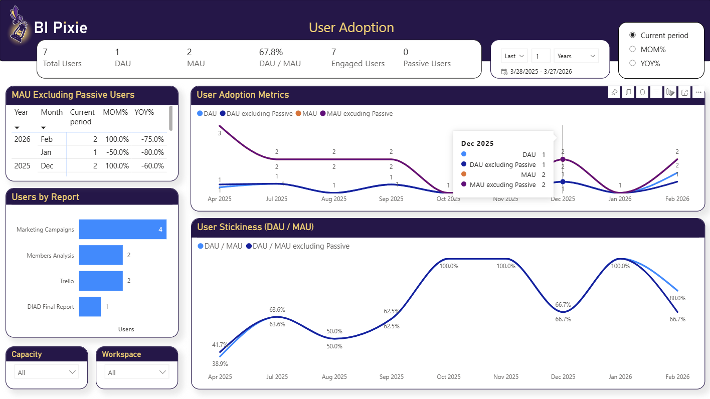
- BI Pixie shows monthly active users per report and how that population grows or shrinks after go-live. BI Pixie uses session duration and interactions per session to separate people who genuinely work in a report from those who open it and leave.
- Satisfaction from the people using the report
- BI Pixie collects satisfaction scores through feedback controls and embedded surveys inside the report, so post-migration sentiment comes from your users rather than from the loudest stakeholder.
- Report speed before and after go-live
- In BI Pixie on Azure, the self-hosted edition you deploy into your own Azure subscription, BI Pixie measures load and render times per report and per visual. "It has been slower since the migration" is the hardest complaint to answer, because by the time it is raised the old platform is gone and nobody measured it. A baseline captured before go-live turns that into a specific report, page, or visual you can point at. Comparing report speed needs your Power BI workspaces integrated with Azure Log Analytics, and the integration must be in place before you migrate, or there is no baseline to compare against.
Download the migration one-pager (PDF, one page, no form.)
Migrating databases and Databricks to Fabric while Power BI stays in use
When you move databases, Databricks, or another cloud data warehouse to Microsoft Fabric, Power BI is in use before the migration and after it. Many existing Power BI reports point at the platform you are retiring, and every one of them needs a decision in the plan phase of each wave.
Effort is the easy half to estimate. Any competent team can look at a report and say whether it needs a new connection string or a rebuild. The half nobody can answer from the report itself is whether it is worth the work, and usage evidence is what lets you rationalize and prioritize the report estate before a wave starts.
Repointing, refactoring, rebuilding and retiring are all decisions about the report itself. A fifth decision is not about a report at all, and it asks which of your semantic models to prepare so that Microsoft Copilot and Fabric data agents answer questions about them correctly. That fifth decision has a different answer from the other four. A report almost nobody opens is an easy retirement, and the semantic model underneath that report can still be the one the business most wants to ask questions of. Retiring the report is right, and retiring the semantic model with it is not.
- Repoint it and leave it alone
- A report with steady monthly users and real interaction depth is working. Change the connection, change nothing else, and protect it through the cutover.
- Refactor it
- When heavy use is concentrated in two pages out of eleven, you know what to keep and what to drop. With page and visual level engagement, a rewrite becomes a scope decision instead of a rebuild of everything that was there before.
- Rebuild it
- High opens with almost no interaction, or a report people open and leave within seconds, usually means the report is being tolerated rather than used. That is a candidate to redesign on the new platform, not to carry across as-is.
- Retire it
- Reports opened by a handful of people a few times a quarter are the cheapest win in any migration. Retiring them removes migration effort, support load, and a data source dependency in one decision.
- Prepare its semantic model for AI
- This decision is about the semantic model rather than the report on top of it. BI Pixie assesses how ready that semantic model is for Microsoft Copilot and Fabric data agents, and names what has to change first. You run the same benchmark before and after your team prepares the semantic model, and BI Pixie compares the two runs, so you can show whether the answers from Copilot and Fabric data agents improved. The assessment is read-only, so nothing is written back to your semantic model, and a first assessment is free on every plan, for up to 500 semantic models and data agents.
BI Pixie does not estimate migration effort. After each wave goes live, BI Pixie shows monthly active users, session depth, and satisfaction scores for the reports on the new platform, so you plan the next wave on what people actually used. In BI Pixie on Azure, the self-hosted edition, BI Pixie also maps your workspaces, semantic models, and dataflows to their underlying connectors, so you can filter to the reports that depend on the platform you are retiring.
What it takes to set up
- 1 Connect your Power BI workspaces and select the reports in scope for the migration.
- 2 Add Pixies. The tracking is invisible to your users.
- 3 Assess the AI Readiness of the semantic models underneath those reports.
- 4 Let a normal reporting cycle run so you have a baseline, then review adoption and engagement per report and per workspace in the BI Pixie Dashboard.
Worth knowing: Baselines start when you add Pixies, so add Pixies to the reports in scope as early as you can. If you can add them before the first wave goes live, you get a genuine before-and-after rather than an after-only picture. Adoption is measured from engagement counts, not from personal data. BI Pixie collects viewer user names only when you turn on Capture user identity in Tracking Setup, which is off by default, and until then it counts viewers by a masked IP address. AI Readiness assessment needs Contributor or higher on the workspace. Benchmarking through your own Fabric data agent needs a paid Fabric capacity, and benchmarking through a generic AI agent needs no Fabric capacity but needs an AI you connect yourself.
Related reading
- Add Pixies to your reports
- BI Pixie metrics reference
- Analyze report performance (self-hosted, needs Azure Log Analytics)
- Passive and active Power BI users
- AI Readiness
- Your Copilot gives bad answers
Other use cases
- Build your AI plan for Power BI from how people use each report today.
- Copilot gives wrong answers when your semantic model is not ready for it.
- A Copilot that answered correctly last quarter can answer wrongly today.
- Power BI usage metrics record that a report was opened, not what happened next.
- Show the return on your Power BI investment with how people use and value each report.
- Power BI usage metrics do not cover your embedded reports.
- Collect satisfaction scores from Power BI users inside the report, not in a separate survey tool.
- Check whether row-level security in Power BI let anyone see data it should have hidden.
- Find the slow Power BI reports that people depend on, and fix those first.
See the data from your own reports
Add Pixies to a report and watch real interaction data arrive. BI Pixie starts free, and the Free plan does not expire.