
Analyze Performance
This feature is supported only in the Azure deployment version.
Data Sources: Azure Log Analytics + BI Pixie Instrumentation
Measuring the effectiveness of your Power BI reports cannot be complete without taking into account performance data. You can extend BI Pixie capabilities beyond user engagement, adoption and satisfaction and analyze the performance of your Power BI reports by connecting BI Pixie Instrumentation to Azure Log Analytics. This functionality requires the Azure deployment of BI Pixie and is not supported in the Starter version.
Before you start collecting performance data in BI Pixie, make sure that your reports are in Power BI workspaces that are integrated with Azure Log Analytics. Learn how to integrate Power BI with Azure Log Analytics here. Once your performance data is collected in a Log Analytics workspace, you can configure your BI Pixie function app to send queries to Log Analytics and collect the results in your BI Pixie storage account.
To start collecting performance data, you will need to deploy BI Pixie on Azure. BI Pixie Instrumentation to your Azure Log Analytics workspace as described in this article. This is an optional feature. BI Pixie does not require you to connect to Azure Log Analytics for any other feature of BI Pixie.
Here are the key benefits of activating the performance collection in BI Pixie:
- Simplify your ongoing operations to analyze complex performance data in Log Analytics.
- Collect the performance metrics of each visual including daily and weekly aggregates of Sum, Average, Median, 75th percentile, and 90th percentile:
- Duration
- Total CPU Time
- Query Processing CPU Time
- Vertipaq Job CPU Time
- Execution Delay
- Query Result Rows
- Collect the performance metrics above over a long period (Note: You can collect up to two years of data in Log Analytics, but using BI Pixie you can collect performance data over a longer period without the need to maintain high log retention period in Log Analytics).
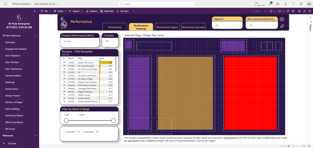
- Analyze any of the performance metrics above in an intuitive heatmap (See the first screenshot below)
- Identify slow, CPU-intense and memory-intense DAX queries over time.
- Correlate performance metrics with engagement metrics to analyze the effectiveness of your reports, pages, and visuals.
- Identify the most impacted users.
Once you activate the performance collection, four pages of BI Pixie Dashboard will be available for analysis.
Performance Metrics in BI Pixie Dashboard
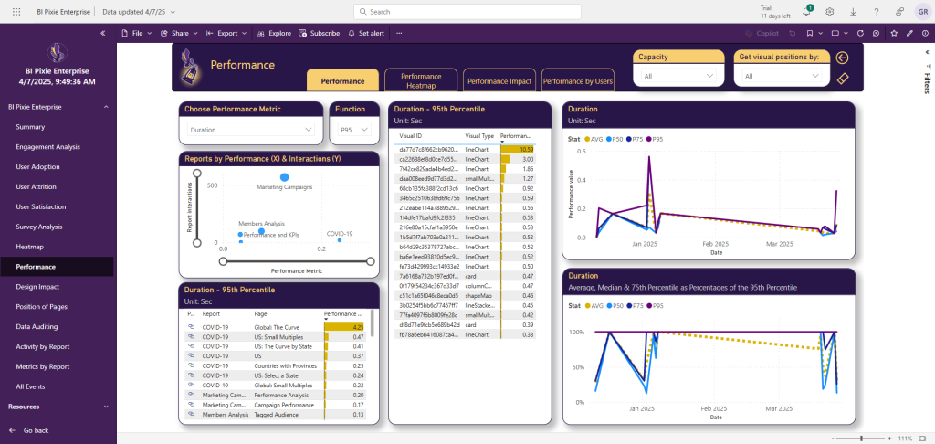
The Performance page in BI Pixie Dashboard includes fours tabs: Performance, Performance Heatmap, Performance Impact and Performance by Users. You can access them by navigating to the Performance page. Use these tabs to analyze the performance metrics of your reports and their underlying semantic models.
In the Performance tab, select one of the performance metrics (Duration, Total CPU Time, Query Processing CPU Time, etc.) and one of the statistical functions (SUM, AVG, P50, P75, P90), and track how effective is your performance optimization effort over time. The line charts (on the right) compare between the average, median, 75th and the 90th percentiles of the selected performance metric. Learn more about the available metrics here.
You can move the mouse over any of the visuals at the center table to open the tooltip that will show the corresponding DAX query and the detected measures and columns that were used in the query.
In the Performance Heatmap tab, select one of the performance metrics (Duration, Total CPU Time, Query Processing CPU Time, etc.) and one of the statistical functions (SUM, AVG, P50, P75, P90), and visualize the performance of specific report pages in the heatmap.
The color of the heatmap will show you the selected metric. When you move the mouse over one of the visual, the tooltip shows the value of the selected metric (e.g. The 90th percentile of the visual duration load time in seconds). You can also find out which tables, columns and measures are used in the relevant visual and how many references they have in the visual's DAX Query.
In the Performance Impact tab, you can analyze the relations between performance and engagement metrics. In the left slicer, you can select the engagement metric to analyze as the Y axis of the scatter chart. At the bottom side of the page, you can select the performance metric and the statistical function to use as the X axis of the scatter chart. The number of users is used as the size of the bubbles.
Using the scatter chart, you can find how different report pages are scattered throughout the performance and engagement dimensions. For example: you can find pages with high CPU time and low engagement. Such pages require attention as their high CPU consumption may not be justifiable.
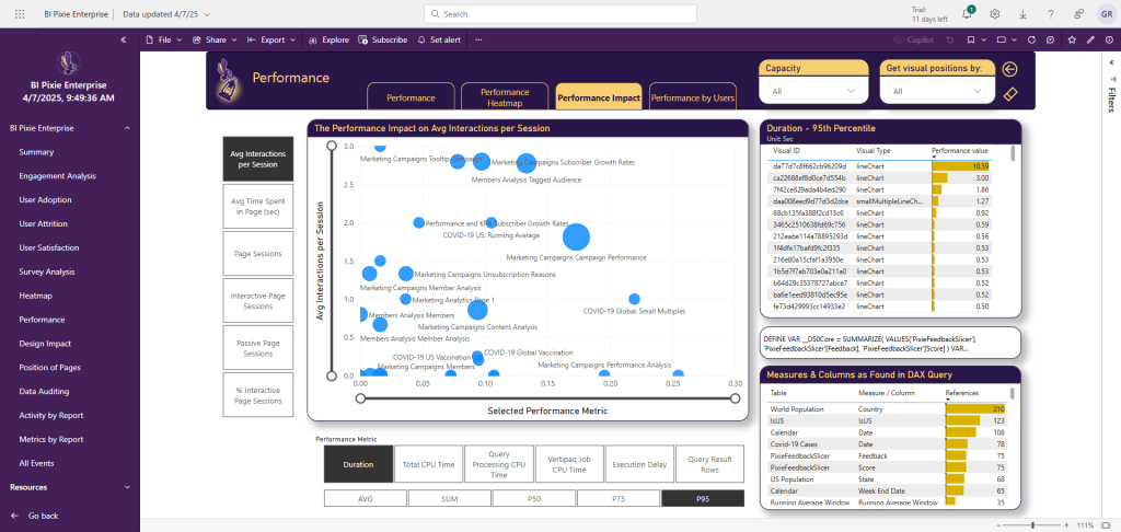
In the left slicer, you can select the engagement metric to analyze as the Y axis of the scatter chart. At the bottom side of the page, you can select the performance metric and the statistical function to use.
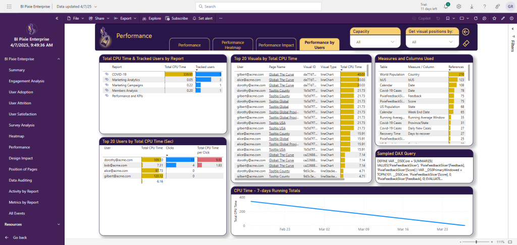
In the Performance Impact by Users tab, you can find the highest-CPU consuming reports and how many users are affected. You can find the top 20 impacted users and the visuals that reached the highest CPU Time.
Setting up the integration with Log Analytics
Permissions
To authorize BI Pixie to collect performance data from go to the function app page in Azure portal and follow these steps:
- In the function app page, select
SettingsandIdentity. - In
System assignedtab, ensure theStatusisOn. - Click
Azure role assignments. - In
Azure role assignmentspage, selectAdd role assignment (Preview). - In Add role assignment (Preview), select Resource group in Scope.
- Select the resource group of the Azure Log Analytics workspace in
Resource group. - In
Role, assign Log Analytics Data Reader (least-privilege: query access only, scoped to this workspace). - Click
Save.
Schedule and other Variables
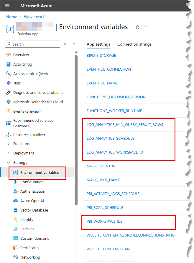
After you activate the performance collection, BI Pixie log_analytics timer function collects the performance data periodically and stores it in your storage account. By default, the timer will be triggered hourly at the first quarter of the hour and get new results since its last run. If this is the first time you run BI Pixie, it will collect the last 180 days from Log Analytics, if data is available.
To change the schedule, go the BI Pixie function app on Azure portal and follow these steps:
- In the function app page, select
Settings. - Select
Environment variables. - Edit the
LOG_ANALYTICS_SCHEDULEvariable. - Change the schedule following the format here. The format is 6 numbers separated by a space character:
{second} {minute} {hour} {day} {month} {day-of-week}. You can use wildcards (*) at the level you want to run the function. For example: “0 15 * * * *” runs the function every hour at 15 minutes and 0 seconds. “0 0 8 * * *” will run the function at 8:00am every day. - Click
Apply. The function app will restart and the timer will activate an immediate collection of logs on start in addition to the collection of new logs following the new schedule.
To change the Log Analytics workspace ID, enter the new ID in the LOG_ANALYTICS_WORKSPACE_ID variable.
To limit the data collection to visuals that load a minimum number of rows, edit the LOG_ANALYTICS_MIN_QUERY_RESULT_ROWS variable. By default, BI Pixie collects performance data of visuals that loaded by minimum 10 query result rows. Query Result Rows are a metric in Log Analytics, they represent the number aggregated data points you have in the visual. For example, a PieChart with only 2 categories has 2 rows. A scatter chart with 100 points in the visual will have 100 points.
You can limit the query results to specified workspaces by editing the PBI_WORKSPACE_IDS variable. Use comma-separated workspace IDs to filter multiple workspaces. By default, all Power BI workspaces that are monitored in Log Analytics will be collected. Note, this field will also filter the Power BI workspaces that BI Pixie retrieves from the tenant scan.
Using performance data as a migration baseline
If you are planning a data estate migration, moving semantic models to a new platform, consolidating capacities, or re-platforming reports, capture your performance baseline before the cutover. Without a before picture, "the reports feel slower since the migration" cannot be verified or refuted, and every regression conversation turns into an argument.
A practical baseline workflow:
- Before the cutover: activate the performance collection at least a few representative weeks ahead, long enough to cover month-end or other peak windows. The Performance Trends tab gives you the pre-migration distribution (average, median, P75, P90) per report and visual.
- After the cutover: keep collecting on the migrated reports. Because BI Pixie retains performance history in your own storage account beyond Log Analytics' retention window, the before and after periods stay comparable side by side.
- Root-cause regressions: compare the same visual's Duration and CPU metrics across the boundary. A slowdown isolated to specific visuals points at their DAX or the new source's query performance; a uniform shift points at capacity or gateway configuration. The DAX query tooltips identify the exact measures and columns involved.
Pair this with the data-source lineage view to scope the baseline to the reports actually affected by the migration, and to confirm afterwards that nothing is still reading from the retired source. Like the rest of this page, this applies to the self-hosted product only.
What's Next
Map data sources to usage with lineage